Product · AI
I gave an AI a job, not a website to review
How I'm using synthetic user testing to find product problems before real users have to.
One of the problems with building your own product is that you know far too much about it.
You know what every button is supposed to do. You know why something has a slightly strange name. You know that if you end up on the wrong screen you can just click here, go back there, and everything will be fine.
Your users know none of that.
Proper user testing is obviously the answer. Put the product in front of people who might actually use it, give them something to do and watch what happens.
But that's not always particularly easy.
I'm building several products on my own. I don't have a research team sitting next to me and I can't recruit ten people every time I change an onboarding flow.
So I've started experimenting with something I'm calling synthetic user testing.
It doesn't replace real users.
But I'm increasingly convinced it can stop me wasting their time on problems I should have found myself.
Don't ask AI to review your website
I've tried the obvious version of this before.
Give an AI a URL or some screenshots and ask:
What do you think of this UX?
You get exactly what you'd expect.
A list of observations. Some good. Some painfully generic. Lots of suggestions about visual hierarchy and clearer calls to action.
That's not really user testing.
So I tried something different.
Instead of asking an AI to review one of my products, I gave it a person to be and a job to do.
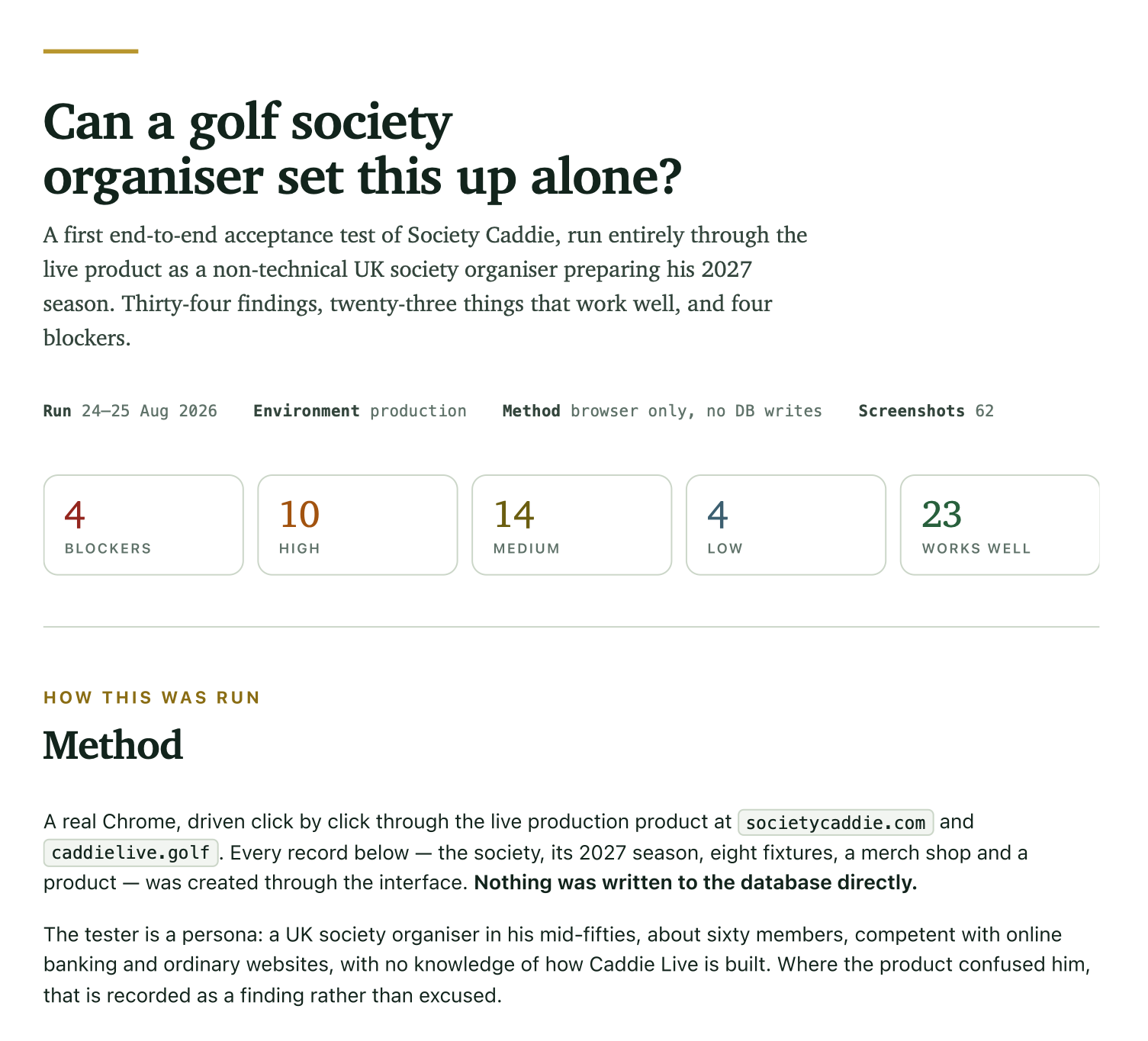
The product was Society Caddie, something I've been building for people who organise golf societies.
The synthetic user was roughly:
A UK golf society organiser in his mid-fifties. Around sixty members. Comfortable using online banking and normal websites. No technical knowledge and absolutely no knowledge of how my product is built.
That last bit was important.
If something confused him, he wasn't allowed to explain it away because he understood what the developer probably meant.
Then I gave him a job.
Set up his fictional golf society. Prepare the 2027 season. Add the fixtures. Set up the society website. Work out how his members would join. Try the merchandise tools.
Basically:
Can this person use the thing I've built without me standing next to him?
Then I made it actually use the product
This is the bit that changed the usefulness of the exercise for me.
The AI wasn't given a collection of screenshots and asked to imagine what might happen.
It opened a real browser and used the live product.
Click by click.
It created the society through the interface. It created a season. It added eight fixtures. It configured the website. It tried the member journey and merchandise.
No writing records directly into the database to make the test easier.
When something went wrong, it documented what it had done, what it expected to happen and what actually happened.
Screenshots were captured as it went.
The final run produced 62 of them.
That distinction feels important.
I don't particularly care whether an AI thinks a button would look nicer somewhere else.
I care a lot if somebody with a specific job clicks that button and ends up somewhere they don't understand.
It wasn't told to hate everything
This was another thing I liked about the result.
The test didn't just produce a giant bug list.
It recognised parts of the product that were doing their job properly.
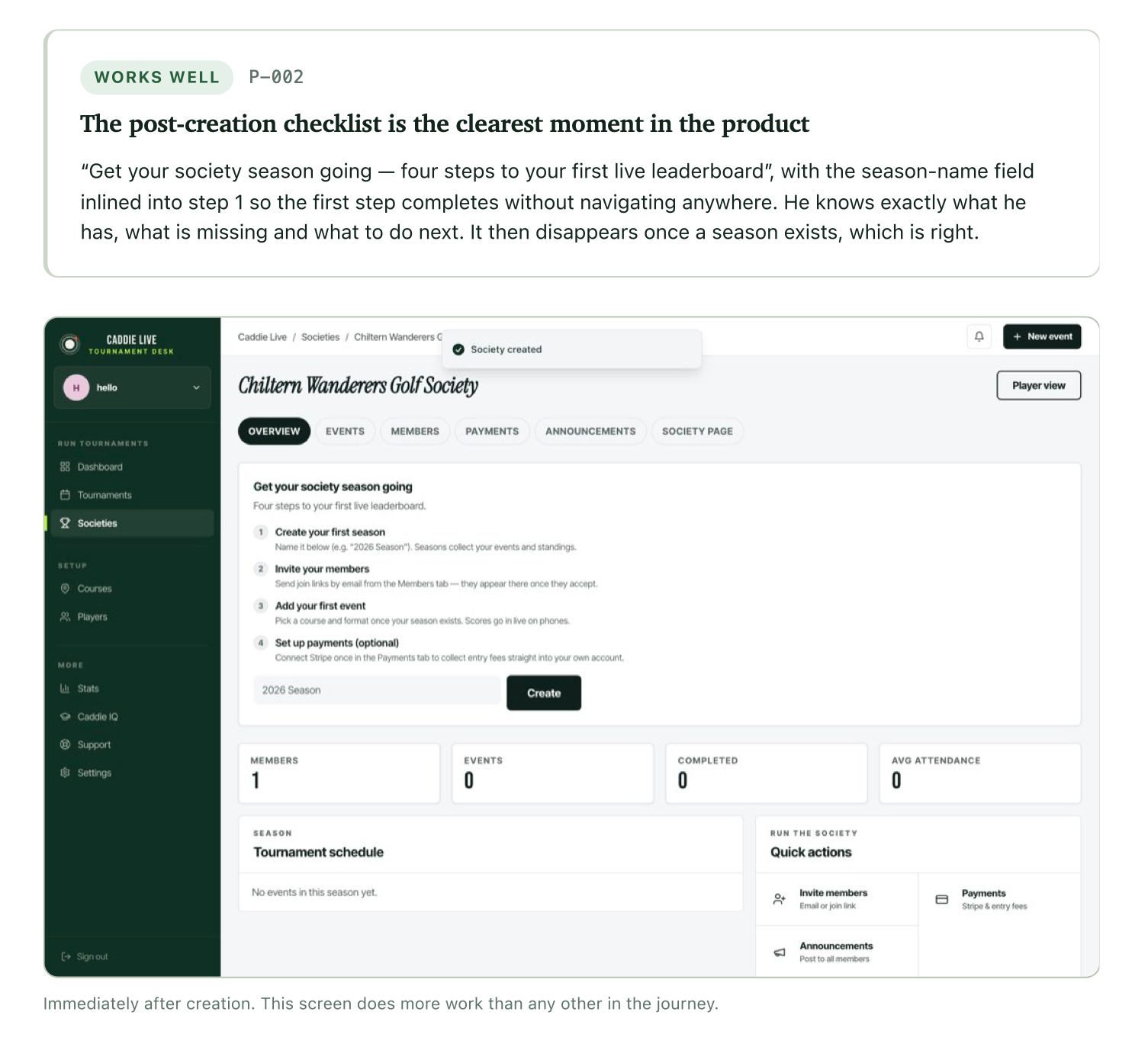
The first-run checklist, for example, was described as:
The clearest moment in the product.
The reason wasn't its colour or typography.
It told the organiser what he had, what was missing and what he should do next. Once he'd done it, the checklist disappeared.
That's useful feedback.
There were similar positives around privacy settings, member join modes, the event wizard and parts of the merchandise setup.
Then it found something I'd completely missed
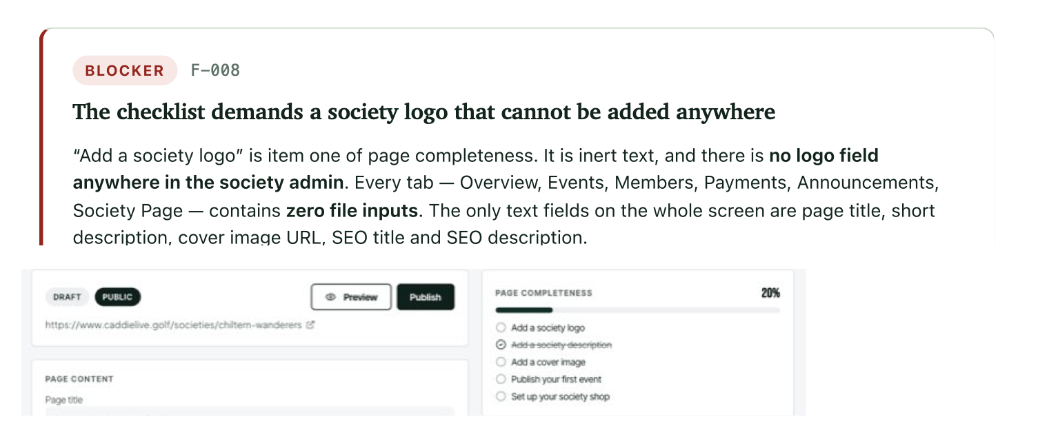
One of the setup tasks told the organiser to:
Add a society logo.
Fair enough.
Except there was nowhere to add one.
Not "the button wasn't obvious".
There was literally no logo upload in the society admin.
The product knew that a logo should exist. The setup checklist measured whether he'd added one. The public website was capable of displaying one.
I'd just neglected to give the person using the product a way of actually doing it.
That's exactly the sort of thing that's easy to miss when you're the person who built it.
I know where the underlying capability exists. I know another part of the product has an uploader. I understand the data model.
My fictional golf organiser doesn't care about any of that.
He just wants to upload his badge.
Some findings weren't bugs at all
This is probably where the exercise became most useful from a product management perspective.
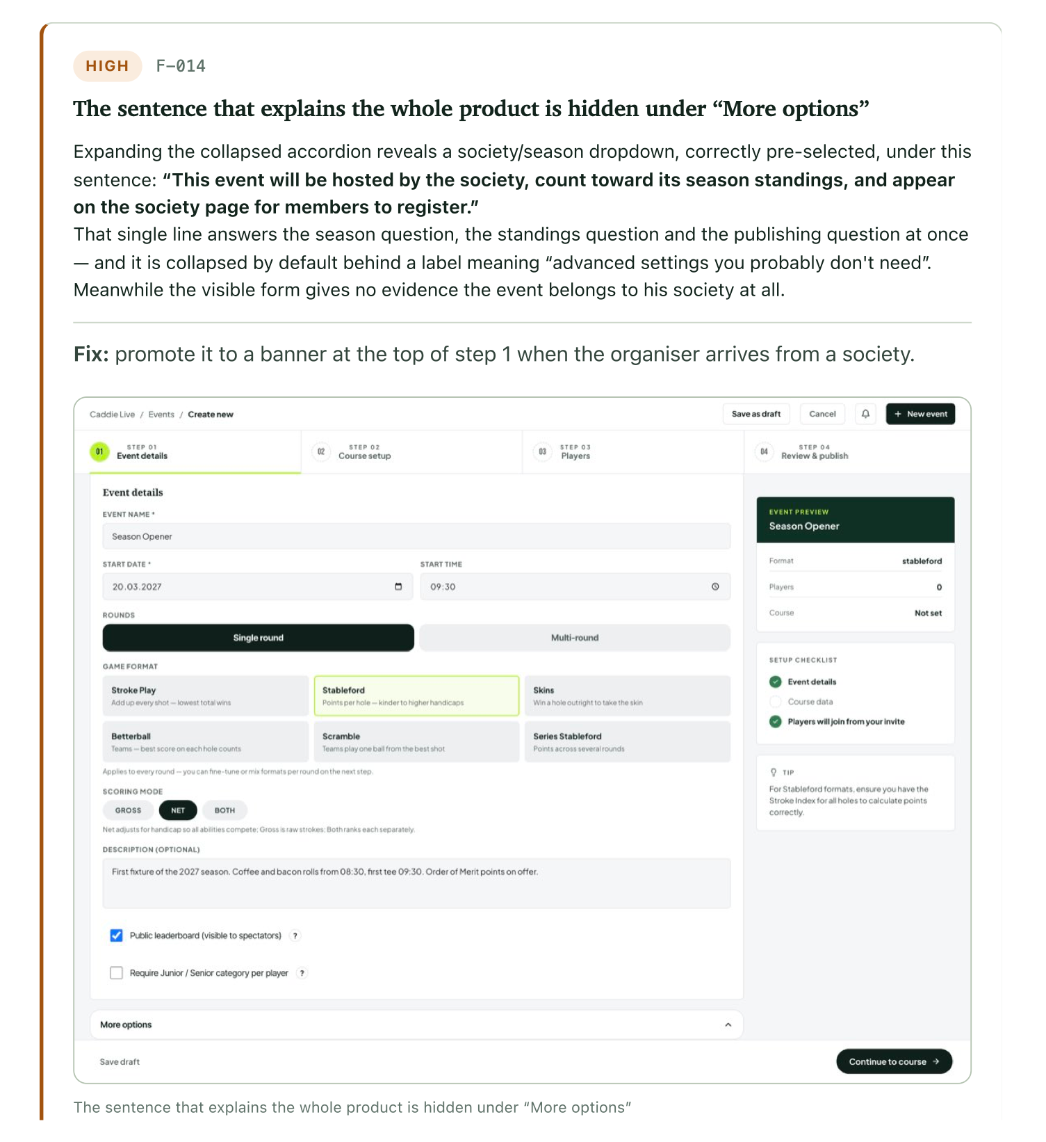
During event creation there was a sentence in the product that explained something quite important:
This event will be hosted by the society, count toward its season standings, and appear on the society page for members to register.
That's actually a pretty good sentence.
It answers three questions an organiser is likely to have.
I'd hidden it under More options.
The functionality worked. There wasn't really a bug to fix.
The information was simply in the wrong place.
That's the sort of finding I find particularly interesting.
A conventional automated test is unlikely to tell me that.
The system is doing exactly what the code says it should do.
The problem only appears when you look at the product through the job somebody is trying to complete.
And then it found the properly broken stuff
Eventually our fictional organiser published his society website.
It actually looked pretty convincing.
Fixtures were there. The next event appeared automatically. It worked on mobile. Things I'd hoped would work did work.
Then his imaginary members arrived.
And couldn't join.
The Apply to join button sent a prospective member into the flow for creating their own society.
That's not a subtle UX improvement.
That's broken.
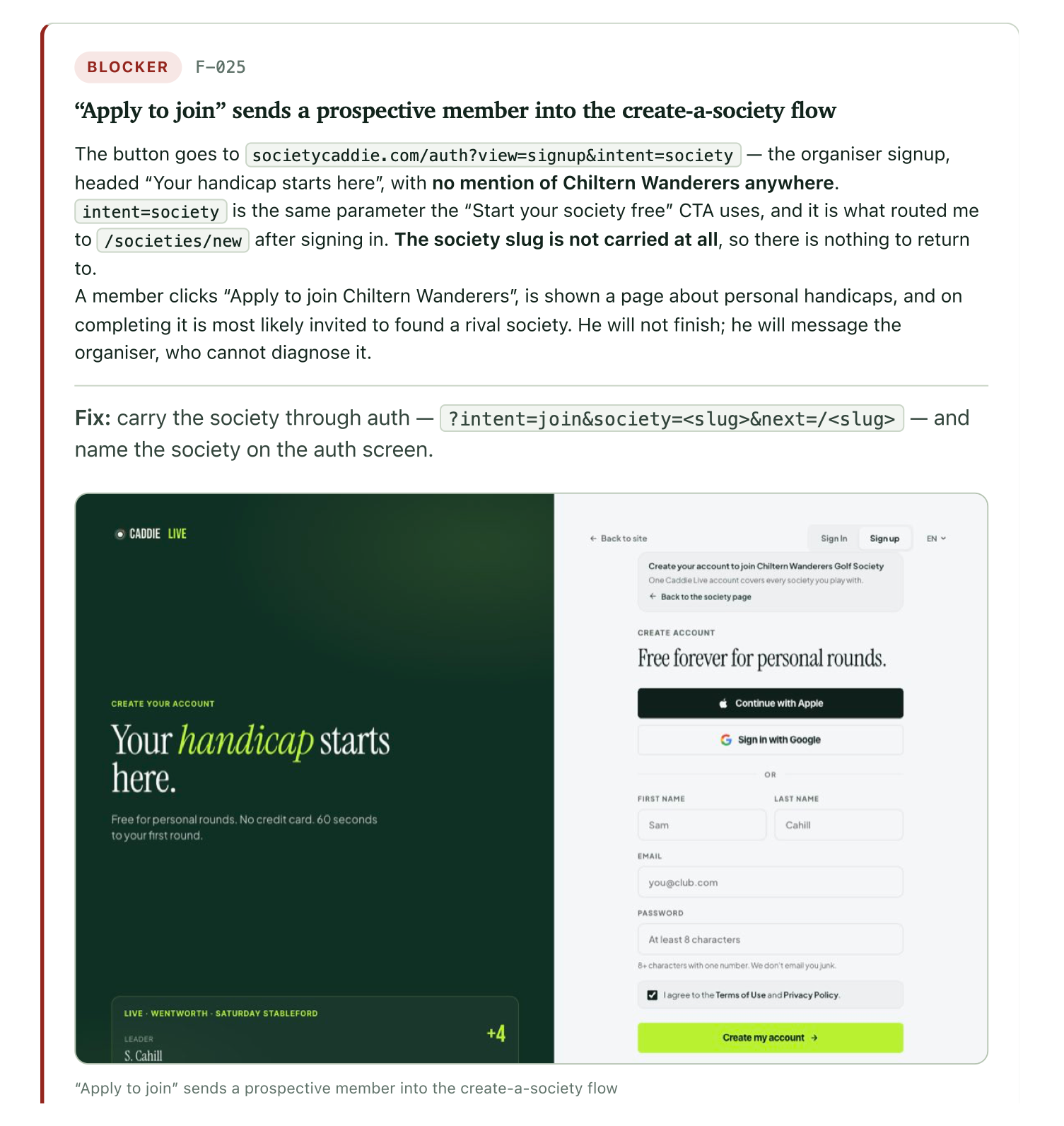
And it's exactly the sort of thing I wanted this process to uncover before I started sending actual golf society organisers to the product.
34 findings isn't a roadmap
The test eventually produced 34 findings, including four blockers, alongside 23 things it thought worked well.
But dumping 34 tickets into a backlog wouldn't be particularly useful.
The more interesting part came at the end.
The findings were turned back into the journey we'd originally asked the persona to complete.
What would actually stop this person succeeding?
Broken member navigation came first.
Then joining and login.
Then the missing image upload.
Then functionality the interface was promising but the user couldn't actually access.
Only after those came things like naming, currency and copy.
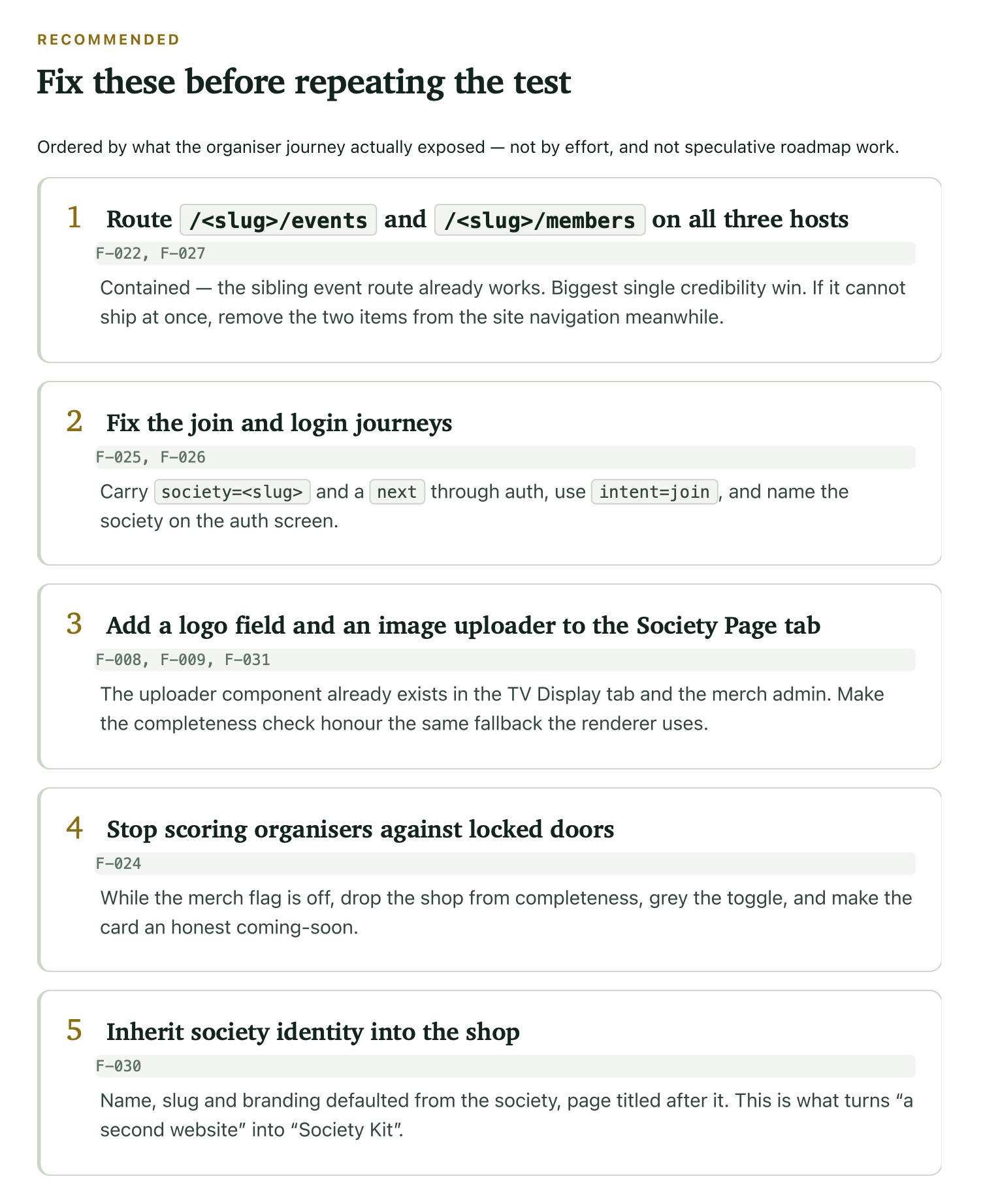
The report explicitly ordered these by what the organiser journey exposed, not by development effort.
That gives me something much more useful than:
Here are 34 things AI doesn't like.
It gives me:
Here are the things stopping this particular person completing this particular job.
That's product work.
This still isn't a real person
There is an obvious problem with all of this.
My golf society organiser doesn't exist.
He isn't going to get annoyed and close the browser.
He doesn't have twenty years of habits from using another system.
He isn't going to misunderstand something for a reason I never anticipated.
He isn't going to tell his mates the website is rubbish.
And he definitely isn't going to give me £99.
Synthetic user testing can't tell me whether people actually want what I've built.
It can't replace conversations with customers, watching real behaviour or looking at the data.
I'm not trying to make it do that.
I've started using versions of the same approach in my day job as a product manager too. Not as a substitute for user research, but as another pass before it.
Because there's not much value in getting a real person onto a call just to discover that the button they need is broken.
I'd rather know that already.
Then I can use the time I have with real people to learn the things only real people can tell me.
Don't waste your users on the easy stuff
That's probably the biggest thing I've taken from the experiment so far.
Real users are incredibly valuable.
Their time is too.
If an AI can find my broken link, missing upload button, contradictory wording or impossible workflow at 11pm while I'm messing around with something I've built, that's brilliant.
Fix it.
Then put the improved version in front of a human.
I suspect I'll keep changing how I do this. Different personas, different levels of experience, tighter scenarios and probably repeating exactly the same journeys after making changes.
I'm also interested in where the boundary is between synthetic user testing, automated QA and actual user research.
I don't think I've worked that out yet.
But I do know this:
Giving an AI a job to complete has taught me considerably more about my product than asking one to review it.
And that's useful enough for me to keep doing it.